What is rc-tooltip?
The rc-tooltip package is a React component for creating simple and customizable tooltips. It allows developers to easily add tooltip functionality to their React applications, providing users with additional context or information when they hover over or focus on an element. The package supports various customization options, including the tooltip's appearance, positioning, and animation.
What are rc-tooltip's main functionalities?
Basic Tooltip
This code sample demonstrates how to create a basic tooltip that appears on top of an element when it is hovered over. The tooltip's content is specified as 'Tooltip text'.
import React from 'react';
import Tooltip from 'rc-tooltip';
import 'rc-tooltip/assets/bootstrap.css';
const BasicTooltip = () => (
<Tooltip placement="top" trigger={['hover']} overlay={<span>Tooltip text</span>}>
<a href="#">Hover me</a>
</Tooltip>
);
Customized Tooltip
This example shows how to create a tooltip that appears to the right of an element when clicked. The tooltip displays custom content, including a custom style and an arrow pointing to the target element.
import React from 'react';
import Tooltip from 'rc-tooltip';
import 'rc-tooltip/assets/bootstrap_white.css';

const CustomTooltip = () => (
  <Tooltip
    placement="right"
    trigger={['click']}
    overlay={<div style={{ height: 50, width: 100, backgroundColor: '#89CFF0' }}>Custom Content</div>}
    arrowContent={<div className="rc-tooltip-arrow-inner"></div>}
  >
    <a href="#">Click me</a>
  </Tooltip>
);
Dynamic Tooltip
This code snippet illustrates how to create a tooltip with dynamic visibility, controlled by the component's state. The tooltip appears when the mouse enters the target element and disappears when it leaves.
import React, { useState } from 'react';
import Tooltip from 'rc-tooltip';

const DynamicTooltip = () => {
  const [visible, setVisible] = useState(false);
  return (
    <Tooltip
      visible={visible}
      onVisibleChange={(vis) => setVisible(vis)}
      overlay={<span>Dynamic Content</span>}
    >
      <a href="#" onMouseEnter={() => setVisible(true)} onMouseLeave={() => setVisible(false)}>Hover or Leave</a>
    </Tooltip>
  );
};
Other packages similar to rc-tooltip
react-tooltip
react-tooltip is another popular tooltip library for React applications. It offers a wide range of customization options similar to rc-tooltip, but with a different API and additional features such as global tooltip management and more extensive styling capabilities.
tippy.js
tippy.js is a highly customizable tooltip and popover library that can be used with React through a wrapper component. It provides more extensive animation and theming options compared to rc-tooltip, making it suitable for more complex tooltip requirements.
rc-tooltip
tooltip ui component for react


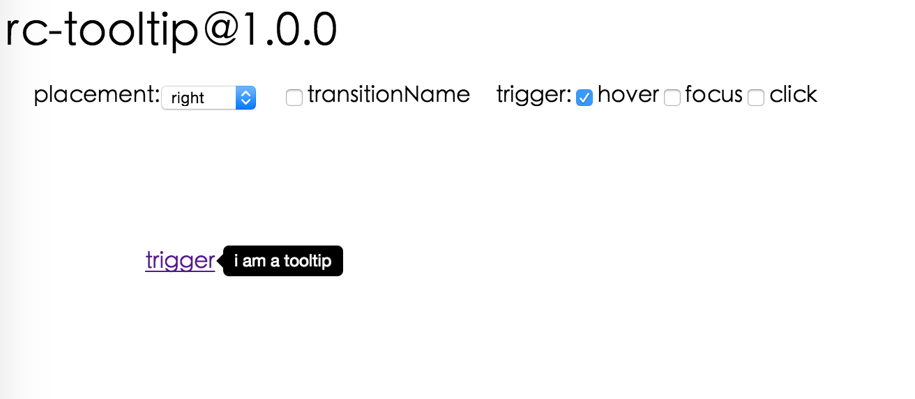
Screenshots
Feature
- support ie8,ie8+,chrome,firefox,safari
install

Usage
var Tooltip = require('rc-tooltip');
var React = require('react');
React.render(<Tooltip placement="left" trigger={['click']} overlay={<span>tooltip</span>}><a href='#'>hover</a></Tooltip>, container);
Example
http://localhost:8007/examples/index.md
online example: http://react-component.github.io/tooltip/examples/
API
props
| name | type | default | description |
|---|
| overlayClassName | string | | additional className added to popup overlay |
| trigger | string[] | ['hover'] | which actions cause tooltip shown. enum of 'hover','click','focus' |
| mouseEnterDelay | number | 0 | delay time to show when mouse enter.unit: s. |
| mouseLeaveDelay | number | 0.1 | delay time to hide when mouse leave.unit: s. |
| overlayStyle | Object | | additional style of overlay node |
| wrapStyle | Object | | additional style of wrap node |
| prefixCls | String | rc-tooltip | prefix class name |
| transitionName | String | | same as https://github.com/react-component/css-transition-group |
| onVisibleChange | Function | | call when visible is changed |
| visible | boolean | | whether tooltip is visible |
| defaultVisible | boolean | | whether tooltip is visible initially |
| placement | String|Object | | one of ['left','right','top','bottom', 'topLeft', 'topRight', 'bottomLeft', 'bottomRight'] or alignConfig of [dom-align](https://github.com/yiminghe/dom-align) |
| overlay | React.Element | | popup content |
| getTooltipContainer | function | | function returning html node which will act as tooltip contaier |
Development
npm install
npm start
Test Case
http://localhost:8007/tests/runner.html?coverage
Coverage
http://localhost:8007/node_modules/rc-server/node_modules/node-jscover/lib/front-end/jscoverage.html?w=http://localhost:8007/tests/runner.html?coverage
License
rc-tooltip is released under the MIT license.


